Tuesday, 14 December 2010

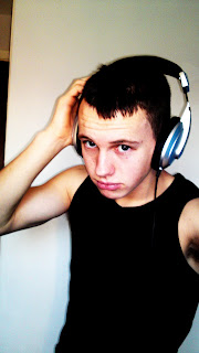
Subsidiary image.

My subsidiary image


This is an original image that I took on holiday in Ibiza. I am using this on my front cover as a subsidiary image to win a free holiday to Ibiza 2011 to the readers who purchase the magazine. This will persuade them to buy the magazine as the genre it is focused on love Ibiza and is one of their year traditions to go there clubbing.

Second draft of the front cover


This is my second draft of my front cover for my music magazine. I have now added a slogan and some sell lines to it. I have also edited the masthead with different colours and size. I have now got to add subsidiary images, more sell lines and other details such as issue number and date.

Thursday, 9 December 2010

Black background of main image


I have edited this image with a black background which I may use on the front cover.

Tuesday, 7 December 2010

Beginning process of making front cover


So far I have removed the background from the image and opened it in Adobe Design. I will decide whether to have a white or black background.Also I will decide on the size,font and colour on the masthead as the one present is just practise process.

Monday, 6 December 2010

The planning for my previous photo shoot.

Shoot date and time
       05/12/10  1:30pm


Image Description


Male standing looking into camera
Shoot Location


House/bedroom
Model / person contact Details
    
       Reece White. Age 17
Abergavenny Wales


Permission Details


     Permission was given by Reece White for the photo's taken and publishing on blog.
Props

       
               Head phones


Plan of shots


Standing in natural light from the window.
Standing against a clear background/wall.
Making eye contact into the camera lense.
Some photo's taken below the model, some centre focused of the model.
To leave a large space above the model's head when taken.
Must be a medium/ medium close up shot.


Backgrounds of the covers


For my magazine cover I have decided to have a plain colour background such as black or white which are featured in the magazine colours above. I think these colours work best because they make the main image stand out a lot more. I will try both colours out in the creating of the magazine front over.

Potential Main Images Of Cover


These are my two favourite images from my photo shoot. I think these are the most affective because of the positioning of the body in the photo. This will benefit me in creating my cover as it has left appropriate space for my masthead and  other things featuring on the magazine. I think it also has good lighting and a clear picture of the face with serious eye contact with the reader to engage them. The photo's also include props associated with the magazine genre which gives an impression to the audience what they want. 


Sunday, 5 December 2010

My Photo Shoot

Here are some photo's that I took for my front cover. One of them will be the main image for my cover. They are all a medium- medium close shot which I thought would be best for my cover. I also shot them in natural day light with a 12 mega pixel camera, which produces better quality photo's.


Monday, 29 November 2010

Mission Statement

BEATZ

KS Production new project BEATZ is a new kind of music dance magazine. BEATZ combines with the latest new dance music and the classic Ibiza anthems to engage the people into the music.
  BEATZ is aimed at the young lively 18-30 men and women. BEATZ readers have a passion for dance music and get's them through their working week for the weekend.
 BEATZ contains all the elements taht able readers to get in the party mode. Includin the latestmusic to downlaods ready for the weekend to party.
BEATZ ensures all ravers are up to date eith the dance life.

My Reader Profile

                                    
  BEATZ
Male-84%
Average age- 21
Still Studying - 66%
Work full time -42%
Married and living with a partner - 22%

Into Dance & Ibiza Anthems
Favourite Radio Station - KISS 101

BIG SPENDERS
£30 Spent on CD'Ss and itunes
92% own a Cd player
44% own a ipod
17 tacks downloaded a month.


GIGS AND EVENTS
95% Go to regualar events
4 Gigs per month
Atleast 3 festivals per year
90% get tickets online
10% over the phone
95% can't live without music
46% are tempted to buy products seen advertised.


My Evaluation Of Questionnaire

For my questionnaire I got 7 males to answer the questions and 3 females as it is mostly males that the magazine is targeting, which i thought would give more suitable answers.
   The favourite masthead for the magazine was 'BEATZ' with 7 votes, although 3 people voteds for 'SONIC'. The reason for these people to choose 'SONIC' i think was because of the macthing slogan to go with it which was 'Get on it like sonic' which also had 3 votes. Although the favourite slogan was 'Read on, Rave on' which had a total of 6 votes. Also 'Weekly rave blasts had 1 vote. Becuase of this i think it is best to slightly change one of the slogans slightly as one of them did not stand out. The best way to achieve this is to slightly change the slogan although keep the word 'rave' in it. but to just word it different. I think this would be appropiate to do because most people liked the slogans which contained the word 'rave'.
 All of the people in question would've rather seen a 'male' artist on the front cover of the magazine which is what I intend to put on there.
  The favourite stories that were chosen to be in the magazine are 'What and where are the recent gigs?' and 'Latestmusic of artists'. These were the two post popular stories in the questionnaire, although i main contain one other when it comes ot creating my magazine front cover.
   The favourite colours that were chose to appear on the magazine cover were 'neon' colours. So any colour which is reflectively bright. Some of the most popluar colours were 'Green' 'Yellow' 'Pink'.
       For the releasing of the magaizine 8 out of the 10 people in question would rather it to be released 'monthly' and the other 'weekly'. I think also it is more appropiate to release it monthly.
     A subject that come in question '9' was that the majority of the people felt that it was important that the magazine contained information and invloved all the lastest music and artists that are currently releasing. Because of this answer being so popular it is one that i will concentrate on the most.
Also the price with the most votes for the magazine was '£1-£1.99' with all 10 people voting for it.

Sunday, 21 November 2010

The target audience for the magazine.

Music Fan Profile

THE HARDCORE RAVER
Dance Music

Age: 18-30  

What do they wear? Men - Designer vest and jeans, which then ends up coming off by the end of the night. 
Women- Hardly anything, very revealing. Bikini's crop tops, tu tu's, leg warmers and bright neon colours. 
All ravers carrying neon sticks and whistles around their necks.

A 'Mad Head' - Mostly referred to who like to 'live life to the max' and party hard. They work through the week to live for the weekends. Traditional party holiday every year to Ibiza. Local raves and clubs which they attend every weekend with the plan to get 'hammered'.

Listening- To hardcore DJ's and dance music which has a strong beat. Such as Tiesto, Darren Styles and Faithless. Dance moves consist of waving arms in the air and stamping feet like hooligans which comes easy under the influence of alcohol.

Found on a Sunday morning: In a completely strange place, unaware of how they got there.

Tuesday, 16 November 2010

My music magazine questionnaire.

1) What gender are you?
Male
Female

2) How old are you?
-18
19-30
31-40
41+

3)What masthead would you prefer to appear on a dance music magazine?
STROBE
ULTRA
BEATZ
RAV3
SONIC

4) Which one of these slogans do you prefer to appear on the magazine front cover?
Dance like no ones watching!
Read on, Rave on!
Get on it like sonic!
Rave Rumour Reports!
Weekly Rave Blasts

5) What gender artist would you prefer to see on the cover of the magazine?
Male
Female

6) What stories would interest you most on the magazine front cover?
Latest music of artists
What and where are the recent gigs?
Music reviews
Backstage information
Artist interviews

7) What colours do you think would work well on this magazine front cover?


8)Would you prefer of the releasing of the magazine for this genre?
Monthly
Weekly

9)What do you think is important for a magazine of this genre to have?


10) What do you think would be an appropriate price for this magazine?
- 99p
£1 - £1.99
£2 - 2.99
£3 +

Monday, 15 November 2010

Music magazine covers that I like!

I like this front cover because of the black and white theme and the position the Lilly Alen is in the main image.

I like this magazine front cover because of the theme with 'ibiza anthems' which is the genre i would like to focus on being 'dance'. I also like the bright yellow colours used in this cover. 
I like this magazine front cover because of the male in the main image and the way he is positioned. He is also an artist in the genre i would be focusing on.

Tuesday, 9 November 2010

My evaluation of my magazine front cover

My magazine front cover is now complete after roughly 3 hours preparing and creating it.
I think the name of the masthead is appropriate as it refers to King Henry Viii School with 'Henry' and also seems magazine friendly like with 'Weekly'. This also implies that the magazine will be produced weekly to students to get. The colours used for the masthead were a yellow infill of the writing and a thick dark blue outline. I think these are very suitable for the magazine as the blue outline make the yellow stands out on the cover which draws attention, and the colours are also associated with King Henry School itself. At first my magazine was designed to have 'Henry's' slightly above 'Weekly' on the cover as I thought it would be easier to fit the masthead on. However I then decided to change this to having them on the same line by altering the thickness and height of the writing which I think worked better. The masthead also was in capital letters and a large thick font which I think made more noticeable.
      The main image on the cover continued to be the two children in uniform which I had currently planned. I think this worked really well on my front cover as the photo had good lighting as it was taken outside on the King Henry site. Although I think my image would've been more successful if I had taken the photo directly in the light, as on the photo it is evident to see that there is a slight shadow on the side of one of the students face. I also think that my main image implies that the magazine is both for male and female that attend the school, as a girl and boy are both in the picture. The picture also relates to the main story in the magazine being 'New Uniform Special' as they are both currently wearing the new uniform and it also visible to see the King Henry Logo which joins the theme of the school magazine.
       My magazine front cover consisted of two subsidiary images, covering two different stories that are involved in the magazine. One of these pictures are Year 7 boys playing rugby on the school field in their school rugby kit. I think this is a good image as it relates to the story 'NEW AFTER SCHOOL CLUBS NOW ON'. I think the image is good as it shows a number of six boys playing the sport, and showing they're having fun which I think will invite pupils to get the magazine and be interested in what it involves. The second image includes four six formers holding their exam papers showing a happy emotion to celebrate their exam success. This also relates to the story shown on the cover of 'Students pass with flying colours'. Both images are both placed at the bottom of the cover as they both fitted perfect in this location and if they were placed anywhere else it would have affected the main image massively. The images also have a think outline around this which makes them stand out and matches the yellow theme of the front cover, they are also rotated slightly to make the magazine seem more exciting.
The following sell lines and stories used on my front cover are : 'New Uniform Special' 'Your non weekly work book!' 'Students Pass with flying colours!' and 'NEW AFTER SCHOOL CLUBS NOW ON!'. I think that all lines direct clearly to the magazine and also link up to the images on the page. The language used for these sell lines are simple and easy to understand, think this worked best because the magazine is aimed at children as young as 11 years old which they wouldn't find difficult. It is evident that there are no mistakes including spelling of the lines on the cover.  All sell lines consists of a different font and size, one of them being,
'Arial'. This mixture of fonts and sizes does not make the cover seem plain but amusing. I also did this by using different coloured fonts including the colours blue and white as I thought they stood out the most sufficiently.
         I think the design and layout works successfully as it is not too over crowded with things and kept simple which is clear to understand. By immediately looking at the cover I think it is possible to see that it is aimed to a school pupil as a school magazine, which is most important. The layout seems colourful and exciting to appeal to the reader other than being boring and plain.
         I think the most successful parts of my magazine font cover is the main image as it stands out massively and has a big impact on the cover itself. I also think my masthead is well done as it is very appealing to the eye with bold colours a catching name to go with it. I finally think the design and colour themes of the magazine work extremely well as it seems 'friendly' to welcome the pupils of the school.
         However if I could improve my magazine cover in any way it would be to put a price sign on the magazine which I originally planned to do when I carried out my market research when asking the price of the magazine. Although forgetting this I think that I should put a bold colour star on the magazine including '99p' in it which would show the cheap price of the magazine which would also encourage people to buy it, however I would then struggle to find a place for it on the cover. The other thing that I would improve on the magazine is taking the image in a better lighting because of the shadow on one of the pupils face, although I don't think it affects the magazine greatly. Overall I think that my magazine cover is successful and would achieve alot of purchases in King Henry Viii School!

Tuesday, 19 October 2010

My photo shoot planning

Shoot date and time
       19/10/10  11:30am


Image Description


Boys playing rugby outside.
Shoot Location


King Henry Viii School Field
Model / person contact Details
    
        Year 7 boys


Permission Details


     Letter was given to pupils for permission signed by their parents.
Props

       
               Rugby balls.


Plan of shots


Action shots 
   The boys are working as a team when     playing rugby and enjoying themselves. 
They are all in their school rugby kit.
Running around, passing the ball and discussing.
Having fun with their friends at school


My Photos

Photo shoot on 19/10/10
These are my possible photo's that will feature on my front cover.
 
Front cover photo of 2 students showing the new uniform.
After school clubs on, girls fitness and boys rugby.
Exam success


Tuesday, 12 October 2010

Results from questionnaire

The questionnaire was given out to 10 people with a range of different gender's and ages within my target audience, which gave fair and valuable results for the school magazine.
     From my questionnaire results it shows that the favourite masthead was 'Henry's Weekly' with 5 votes, with 'Crown Jewels' with 3 votes which came second favourite. From this I think that this will be the most appropriate one to use as the other mastheads in question had lower votes and I think this will be the most affective.
     From question 6, the results prove that 'You weekly non work book!' was the most preferable slogan, with again 5 people choosing this. However 'Top of the class' and 'All you need to know' only had one vote each. From this I think the most suitable slogan one to use will be 'Your weekly non work book!' because of the highest amount of votes and the most unique answer.
   Question 7 was asking what price people would pay for the magazine. For this question all 10 people has chosen '50p-99p' which I think is the most appropriate price to charge for the school magazine and to show on the school front cover.
   The most popular choice for the story to feature in the magazine was 'New uniform' with 8 people choosing it. The second most popular answer was 'Clubs and activities' however with only 2 chosen. From this result I think the best story to use should be 'New uniform' because of the high number of votes from the target audience which shows that they are very interested in the story which will have a good influence on the magazine cover.
   Question 9 asks what would be the best image to use on the cover of the magazine. 6 out of the 10 people asked chose 'Students in new uniform' and the other 4 chose Students with exam papers'. From this result there is not a large range difference between the two answers and I think that both of the images would be appropriate for the cover.
  The last question was asking what colours the target audience thought they associated with the school, choosing as many colours as they wanted. All of the people in question chose the colour 'yellow' which will be a definite colour to use on the magazine. The second most popular answer was 'blue' with 8 out of 10 people choosing this, from this result I think this also should be another colour should be used as it has such a high answer. The other 2 colours that both had 4 people chose them was 'white' and 'black'. Because of this even choice I think that it would be best to use either one.


Wednesday, 22 September 2010

Magazine Front Cover Questionnaire.

Please circle the appropriate answer

  1. How old are you?
    • 11-13
    • 14-16
    • 17-19

  1. What year are you in?
    • Year 7-8
    • Year 9-10
    • Year 11-12
    • Year 13+

  1. What gender are you?
    • Male
    • Female

  1. What type of magazine do you prefer to read?
    • Music
    • Film
    • Sport
    • Gossip
    • Fashion
    • Other….. Please State………............

  1. Which of these mastheads would you think would be best for King Henry Viii School magazine?
    • Crown Jewels
    • Henry’s Weekly
    • 8th Script
    • KHS
    • Other……Please State…………

  1. Which of these slogans do you prefer?
    • Top of the class!
    • Top news for you!
    • Your weekly non work book!
    • All you need to know!

7. How much would you pay for a school magazine?
·        50p – 99p
·        £1 - £1.99
·        £2 – £2.99
·        £3+

    8. Which one of these stories would you be most interested in featuring in the magazine?
  • New uniform
  • Clubs and activities
  • Access for all
  • Exam success
  • New classrooms

9. Which of the following images would you want to see on the cover of a school magazine?
·        Students in new uniform
·        Sixth Form
·        Students with Exam Papers
·        School production
·        New Teachers

10. Which of the following colours do you associate with the school to use on the magazine? You may choose as many as you want.
  • Red
  • Yellow
  • Blue
  • Green
  • White
  • Brown
  • Black