Tuesday, 14 December 2010

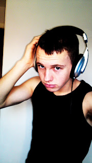
Subsidiary image.

My subsidiary image


This is an original image that I took on holiday in Ibiza. I am using this on my front cover as a subsidiary image to win a free holiday to Ibiza 2011 to the readers who purchase the magazine. This will persuade them to buy the magazine as the genre it is focused on love Ibiza and is one of their year traditions to go there clubbing.

Second draft of the front cover


This is my second draft of my front cover for my music magazine. I have now added a slogan and some sell lines to it. I have also edited the masthead with different colours and size. I have now got to add subsidiary images, more sell lines and other details such as issue number and date.

Thursday, 9 December 2010

Black background of main image


I have edited this image with a black background which I may use on the front cover.

Tuesday, 7 December 2010

Beginning process of making front cover


So far I have removed the background from the image and opened it in Adobe Design. I will decide whether to have a white or black background.Also I will decide on the size,font and colour on the masthead as the one present is just practise process.

Monday, 6 December 2010

The planning for my previous photo shoot.

Shoot date and time
       05/12/10  1:30pm


Image Description


Male standing looking into camera
Shoot Location


House/bedroom
Model / person contact Details
    
       Reece White. Age 17
Abergavenny Wales


Permission Details


     Permission was given by Reece White for the photo's taken and publishing on blog.
Props

       
               Head phones


Plan of shots


Standing in natural light from the window.
Standing against a clear background/wall.
Making eye contact into the camera lense.
Some photo's taken below the model, some centre focused of the model.
To leave a large space above the model's head when taken.
Must be a medium/ medium close up shot.


Backgrounds of the covers


For my magazine cover I have decided to have a plain colour background such as black or white which are featured in the magazine colours above. I think these colours work best because they make the main image stand out a lot more. I will try both colours out in the creating of the magazine front over.

Potential Main Images Of Cover


These are my two favourite images from my photo shoot. I think these are the most affective because of the positioning of the body in the photo. This will benefit me in creating my cover as it has left appropriate space for my masthead and  other things featuring on the magazine. I think it also has good lighting and a clear picture of the face with serious eye contact with the reader to engage them. The photo's also include props associated with the magazine genre which gives an impression to the audience what they want. 


Sunday, 5 December 2010

My Photo Shoot

Here are some photo's that I took for my front cover. One of them will be the main image for my cover. They are all a medium- medium close shot which I thought would be best for my cover. I also shot them in natural day light with a 12 mega pixel camera, which produces better quality photo's.